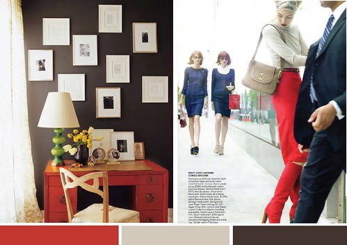
Rich chocolate calms the intensity of ruby red and the cool taupe adds a cozy but light feel. Perfect for classically tailored rooms and ensembles!
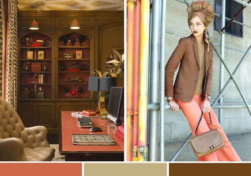
I'm adoring the richness of bronze for fall - paired with an unexpected coral is stays current and fresh!
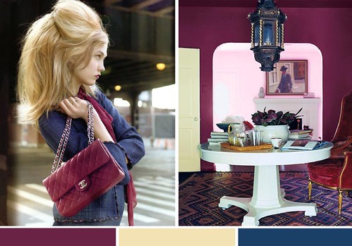
Mmmm, very berry, don't you think? The saturated plum and teal gets a little lift with a rich cream! Especially loving this combo for inspired tabletops right now too!
*editorial images by raymond meier, interiors via unknown, jay jeffers and domino
Loving the gorgeous jewel tones of berry and teal!
ReplyDeletexoxo Laura
Love them all! Jewel tones are definitely in this season!
ReplyDeleteLove all these moody autumn shades! So much inspiration for our new apartment here in San Francisco!
ReplyDeletexx Katie
The second image is singing to me in the decor and the clothing - hmmm...
ReplyDeletei love autumn colors!! love from spain
ReplyDeleteI can't get enough of the plum colors lately. LOVE them. Yum!
ReplyDeleteThe plum walls and the poofy hair are fabulous! Yum!
ReplyDeleteI just bought nailpolish in almot the exact shade of that plum wall. Love!
ReplyDeleteThat amazing red desk drew me in right away! What a sleek statement piece to have as a dressing table or even unconventional work desk. Love.
ReplyDeleteLOVE that last palette!! Wish a client would choose that for a fall wedding so I could design something around it! Xoxo, c
ReplyDeleteThese are gorgeous and could quite possibly break me out of my black mode ! At least temporarily ;) LOVING the big hair !!
ReplyDeleteI love all three combos...though the berry and teal truly speak to me!
ReplyDeleteNice eye! Love all of those colors combos!
ReplyDeleteGorgeous.. especially the first color combo. :)
ReplyDeletelooks different, unique and the berry? i find it NEW! great post as always!!
ReplyDeletewww.constantcatwalk.blogspot.com
I love all three, great post.
ReplyDeleteI love each and everyone of these color combinations - especially the first one! Can't wait to start wearing my fall clothes!
ReplyDeleteI'm so happy you paired those editorial images with interiors. I have been obsessed with those beautiful shots since I saw them in the mag. It's great to see them so perfectly paired. Thanks!
ReplyDeleteWe can't get enough of this post. Thanks for the inspiration!
ReplyDeletehttp://applesandonions.com/library/inspired-by-cocokelly/
Cass! YOU are soooo good! The images you've paired are utter perfection. Love you!
ReplyDeletexo
-j
bronze and coral. Hmmm delectable. So girly and almost retro.
ReplyDelete